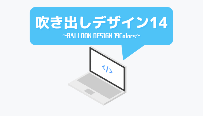

サイト内でもよく使う「吹き出し」の形のデザイン。
文章の途中で挟むことで見やすくなり、より分かりやすくなり、滞在時間も上昇すると言われています。
今回の記事では、吹き出しの作り方の基本を紹介しつつ、サンプルを多めに紹介していきます。
デザインは14種、色別で19種紹介していきたいと思います!
WordPressだけでなく、はてぶ、アメブロでも使える内容となっております!
吹き出しをブログ内で使う方法
使い方が分かっているという人は飛ばしてもらっても構いません。
紹介しているHTMLは(HTML編集モードにするなどして)記事中にそのまま貼り付け。
CSSはstyle.cssなど、各ブログサービスのCSSを設定している場所に貼り付けましょう。
例えばWordPressなら、
にCSSを貼り付けです。
はてぶでも、Amebaでもコピペだけで簡単に使用可能ですので、サクッと検索してやってみましょう!
また、ここで紹介している吹き出しは、大体下側のみに余白が少しあるだけです。
基本の吹き出し4つ
基本的な吹き出しを紹介していきます。
:beforeという疑似要素を使用して三角形をつくり、それをうまい具合に配置することで吹き出しの基本的なデザインを作ります。
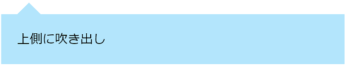
<div class="balloon-top">
上側に吹き出し
</div>.balloon-top{
position: relative;
padding: 20px;
background-color: #b3e5fc;
margin-bottom: 2em;
}
/* beforeで三角を表現 */
.balloon-top::before{
content: '';
position: absolute;
left: 20px;
top: -15px;
display: block;
width: 0;
height: 0;
border-right: 15px solid transparent;
border-bottom: 15px solid #b3e5fc;
border-left: 15px solid transparent;
}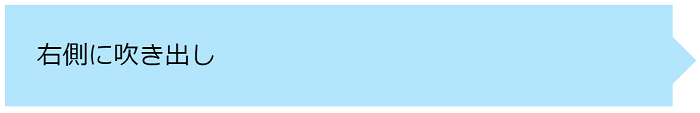
<div class="balloon-right">
右側に吹き出し
</div>.balloon-right{
position: relative;
padding: 20px;
background-color: #b3e5fc;
margin-bottom: 2em;
margin-right: 1em;
}
.balloon-right::before{
content: '';
position: absolute;
display: block;
width: 0;
height: 0;
right: -15px;
top: 20px;
border-left: 15px solid #b3e5fc;
border-top: 15px solid transparent;
border-bottom: 15px solid transparent;
}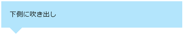
<div class="balloon-bottom">
下側に吹き出し
</div>.balloon-bottom{
position: relative;
padding: 20px;
background-color: #b3e5fc;
margin-bottom: 2em;
}
.balloon-bottom::before{
content: '';
position: absolute;
display: block;
width: 0;
height: 0;
left: 20px;
bottom: -15px;
border-top: 15px solid #b3e5fc;
border-right: 15px solid transparent;
border-left: 15px solid transparent;
}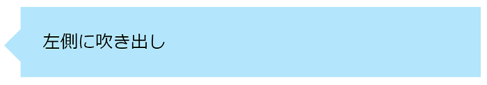
<div class="balloon-left">
左側に吹き出し
</div>.balloon-left{
position: relative;
padding: 20px;
background-color: #b3e5fc;
margin-bottom: 2em;
margin-left: 1em;
}
.balloon-left::before{
content: '';
position: absolute;
display: block;
width: 0;
height: 0;
left: -15px;
top: 20px;
border-right: 15px solid #b3e5fc;
border-top: 15px solid transparent;
border-bottom: 15px solid transparent;
}基本の吹き出し―枠線付き4つ
枠線付きの吹き出しは、:beforeも:afterも使用します。
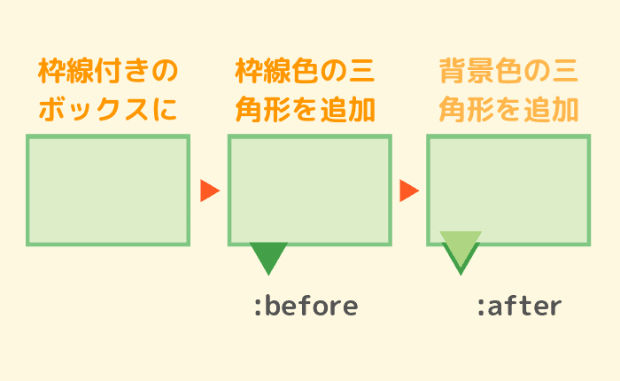
画像は分かりやすいように色を多少変えていますが、サイズの違う三角形を2つ使用して、枠線のついた吹き出しに見せています。
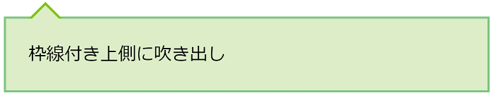
<div class="balloon-top-border">
枠線付き上側に吹き出し
</div>.balloon-top-border{
position: relative;
padding: 20px;
background-color: #dcedc8;
border: 2px solid #81c784;
margin-bottom: 2em;
}
.balloon-top-border::before{
content: '';
position: absolute;
display: block;
width: 0;
height: 0;
left: 20px;
top: -15px;
border-right: 15px solid transparent;
border-bottom: 15px solid #81c714;
border-left: 15px solid transparent;
}
.balloon-top-border::after{
content: '';
position: absolute;
display: block;
width: 0;
height: 0;
left: 20px;
top: -12px;
border-right: 15px solid transparent;
border-bottom: 15px solid #dcedc8;
border-left: 15px solid transparent;
}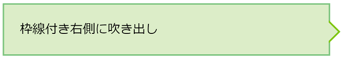
<div class="balloon-right-border">
枠線付き右側に吹き出し
</div>.balloon-right-border{
position: relative;
padding: 20px;
background-color: #dcedc8;
border: 2px solid #81c784;
margin-bottom: 2em;
margin-right: 1em;
}
.balloon-right-border::before{
content: '';
position: absolute;
display: block;
width: 0;
height: 0;
right: -15px;
top: 20px;
border-left: 15px solid #81c714;
border-top: 15px solid transparent;
border-bottom: 15px solid transparent;
}
.balloon-right-border::after{
content: '';
position: absolute;
display: block;
width: 0;
height: 0;
right: -12px;
top: 20px;
border-left: 15px solid #dcedc8;
border-top: 15px solid transparent;
border-bottom: 15px solid transparent;
}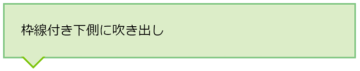
<div class="balloon-bottom-border">
枠線付き下側に吹き出し
</div>.balloon-bottom-border{
position: relative;
padding: 20px;
background-color: #dcedc8;
border: 2px solid #81c784;
margin-bottom: 2em;
}
.balloon-bottom-border::before{
content: '';
position: absolute;
display: block;
width: 0;
height: 0;
left: 20px;
bottom: -15px;
border-top: 15px solid #81c714;
border-right: 15px solid transparent;
border-left: 15px solid transparent;
}
.balloon-bottom-border::after{
content: '';
position: absolute;
display: block;
width: 0;
height: 0;
left: 20px;
bottom: -12px;
border-top: 15px solid #dcedc8;
border-right: 15px solid transparent;
border-left: 15px solid transparent;
}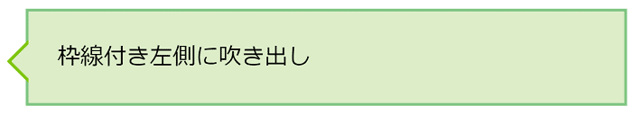
<div class="balloon-left-border">
枠線付き左側に吹き出し
</div>.balloon-left-border{
position: relative;
padding: 20px;
background-color: #dcedc8;
border: 2px solid #81c784;
margin-bottom: 2em;
margin-left: 1em;
}
.balloon-left-border::before{
content: '';
position: absolute;
display: block;
width: 0;
height: 0;
left: -15px;
top: 20px;
border-right: 15px solid #81c714;
border-top: 15px solid transparent;
border-bottom: 15px solid transparent;
}
.balloon-left-border::after{
content: '';
position: absolute;
display: block;
width: 0;
height: 0;
left: -12px;
top: 20px;
border-right: 15px solid #dcedc8;
border-top: 15px solid transparent;
border-bottom: 15px solid transparent;
}吹き出しの角を丸める
吹き出しの角の部分を丸める方法は簡単です。
border-radius: 〇px;をCSSに追加するだけです。
サンプルを二つだけ紹介します!
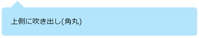
<div class="balloon-top">
上側に吹き出し(角丸)
</div>.balloon-top{
position: relative;
padding: 20px;
background-color: #b3e5fc;
margin-bottom: 2em;
border-radius: 7px;
}
/* beforeで三角を表現 */
.balloon-top::before{
content: '';
position: absolute;
left: 20px;
top: -15px;
display: block;
width: 0;
height: 0;
border-right: 15px solid transparent;
border-bottom: 15px solid #b3e5fc;
border-left: 15px solid transparent;
}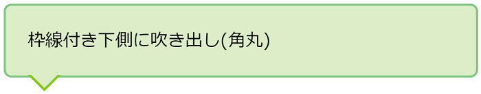
<div class="balloon-bottom-border">
枠線付き下側に吹き出し(角丸)
</div>.balloon-bottom-border{
position: relative;
padding: 20px;
background-color: #dcedc8;
border: 2px solid #81c784;
margin-bottom: 2em;
border-radius: 7px;
}
.balloon-bottom-border::before{
content: '';
position: absolute;
display: block;
width: 0;
height: 0;
left: 20px;
bottom: -15px;
border-top: 15px solid #81c714;
border-right: 15px solid transparent;
border-left: 15px solid transparent;
}
.balloon-bottom-border::after{
content: '';
position: absolute;
display: block;
width: 0;
height: 0;
left: 20px;
bottom: -12px;
border-top: 15px solid #dcedc8;
border-right: 15px solid transparent;
border-left: 15px solid transparent;
}いずれも、一度紹介したCSSに1行足しただけです。
簡単にアレンジできるので、覚えておきましょう!
思っている風・考えている風吹き出し
何かを思っている風の吹き出しです。
ちょっと一言添えるときなどに使用しましょう!
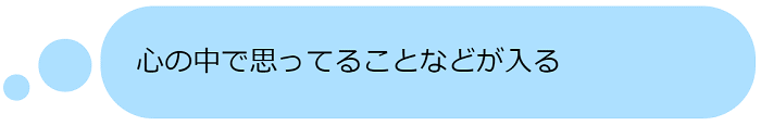
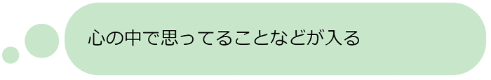
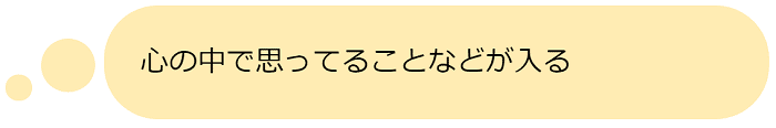
<div class="balloon-think">
心の中で思ってることなどが入る
</div>/* 吹き出し本体 */
.balloon-think{
position: relative;
padding: 20px;
background-color: #ade0ff;
border-radius: 30px;
margin-left: 4em;
margin-bottom: 2em;
}
/* 大きい丸 */
.balloon-think::before{
content: '';
position: absolute;
display: block;
border-radius: 50%;
background-color: #ade0ff;
left: -35px;
bottom: 15px;
width: 30px;
height: 30px;
}
/* 小さい丸 */
.balloon-think::after{
content: '';
position: absolute;
display: block;
border-radius: 50%;
background-color: #ade0ff;
left: -55px;
bottom: 10px;
width: 15px;
height: 15px;
}/* 吹き出し本体 */
.balloon-think{
position: relative;
padding: 20px;
background-color: #c8e6c9;
border-radius: 30px;
margin-left: 4em;
margin-bottom: 2em;
}
/* 大きい丸 */
.balloon-think::before{
content: '';
position: absolute;
display: block;
border-radius: 50%;
background-color: #c8e6c9;
left: -35px;
bottom: 15px;
width: 30px;
height: 30px;
}
/* 小さい丸 */
.balloon-think::after{
content: '';
position: absolute;
display: block;
border-radius: 50%;
background-color: #c8e6c9;
left: -55px;
bottom: 10px;
width: 15px;
height: 15px;
}/* 吹き出し本体 */
.balloon-think{
position: relative;
padding: 20px;
background-color: #ffecb3;
border-radius: 30px;
margin-left: 4em;
margin-bottom: 2em;
}
/* 大きい丸 */
.balloon-think::before{
content: '';
position: absolute;
display: block;
border-radius: 50%;
background-color: #ffecb3;
left: -35px;
bottom: 15px;
width: 30px;
height: 30px;
}
/* 小さい丸 */
.balloon-think::after{
content: '';
position: absolute;
display: block;
border-radius: 50%;
background-color: #ffecb3;
left: -55px;
bottom: 10px;
width: 15px;
height: 15px;
}影付きの吹き出し
影付きの吹き出しでは、:beforeで三角を、:afterで影の三角部分を作っています。
そのため、枠線付きで影付きを作るのは難易度が高くなります・・・。
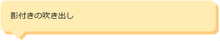
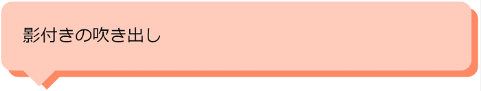
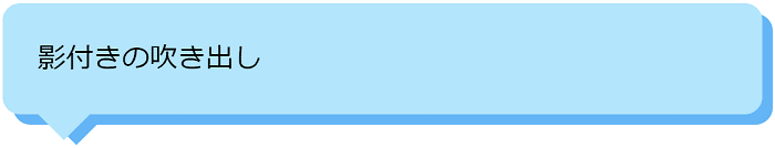
<div class="balloon-shadow">
影付きの吹き出し
</div>/* 吹き出し本体 */
.balloon-shadow{
position: relative;
padding: 20px;
background-color: #ffecb3;
border-radius: 10px;
box-shadow: 6px 6px 0px 0px #ffcc80;/*影*/
margin-bottom: 2em;
}
/* 三角アイコン */
.balloon-shadow::after{
content: '';
position: absolute;
display: block;
width: 0;
height: 0;
left: 20px;
bottom: -15px;
border-top: 15px solid #ffecb3;
border-right: 15px solid transparent;
border-left: 15px solid transparent;
}
/* 三角アイコンの影 */
.balloon-shadow::before{
content: '';
position: absolute;
display: block;
width: 0;
height: 0;
left: 27px;
bottom: -18px;
border-top: 15px solid #ffcc80;
border-right: 15px solid transparent;
border-left: 15px solid transparent;
}/* 吹き出し本体 */
.balloon-shadow{
position: relative;
padding: 20px;
background-color: #ffccbc;
border-radius: 10px;
box-shadow: 6px 6px 0px 0px #ff8a65;/*影*/
margin-bottom: 2em;
}
/* 三角アイコン */
.balloon-shadow::after{
content: '';
position: absolute;
display: block;
width: 0;
height: 0;
left: 20px;
bottom: -15px;
border-top: 15px solid #ffccbc;
border-right: 15px solid transparent;
border-left: 15px solid transparent;
}
/* 三角アイコンの影 */
.balloon-shadow::before{
content: '';
position: absolute;
display: block;
width: 0;
height: 0;
left: 27px;
bottom: -18px;
border-top: 15px solid #ff8a65;
border-right: 15px solid transparent;
border-left: 15px solid transparent;
}/* 吹き出し本体 */
.balloon-shadow{
position: relative;
padding: 20px;
background-color: #b3e5fc;
border-radius: 10px;
box-shadow: 6px 6px 0px 0px #64b5f6;/*影*/
margin-bottom: 2em;
}
/* 三角アイコン */
.balloon-shadow::after{
content: '';
position: absolute;
display: block;
width: 0;
height: 0;
left: 20px;
bottom: -15px;
border-top: 15px solid #b3e5fc;
border-right: 15px solid transparent;
border-left: 15px solid transparent;
}
/* 三角アイコンの影 */
.balloon-shadow::before{
content: '';
position: absolute;
display: block;
width: 0;
height: 0;
left: 27px;
bottom: -18px;
border-top: 15px solid #64b5f6;
border-right: 15px solid transparent;
border-left: 15px solid transparent;
}お知らせに使う吹き出し
文字の左上に動く吹き出しがあればだれでも見てしまうものです。
吹き出しの角を丸くする、文字をPointなどに変えるなど、アレンジは自由自在です。
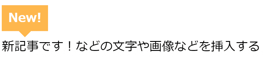
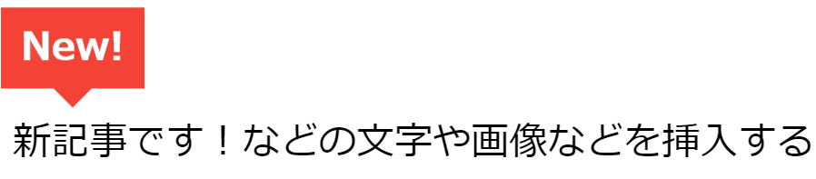
<div class="article">
  <div class="balloon-head move">New!</div>
  新記事です!などの文字や画像などを挿入する
</div>.article {
position: relative;
padding: 10px 5px;
margin-top: 3em;
}
.balloon-head{
position: absolute;
top: -36px;
width: 50px;
margin: 0 auto 40px;
padding: 5px;
background: #ffb74d;
text-align: center;
font-weight: bold;
color: #fff;
}
.balloon-head::after {
content: '';
border: 8px solid transparent;
border-top-color: #ffb74d;
position: absolute;
bottom: -16px;
left: 50%;
margin-left: -8px;
}
.move {
animation: 0.5s move infinite alternate linear;
}
@keyframes move {
to { transform: transtateY(0); }
from { transform: translateY(4px); }
}.article {
position: relative;
padding: 10px 5px;
margin-top: 3em;
}
.balloon-head{
position: absolute;
top: -36px;
width: 50px;
margin: 0 auto 40px;
padding: 5px;
background: #f44336;
text-align: center;
font-weight: bold;
color: #fff;
}
.balloon-head::after {
content: '';
border: 8px solid transparent;
border-top-color: #f44336;
position: absolute;
bottom: -16px;
left: 50%;
margin-left: -8px;
}
.move {
animation: 0.5s move infinite alternate linear;
}
@keyframes move {
to { transform: transtateY(0); }
from { transform: translateY(4px); }
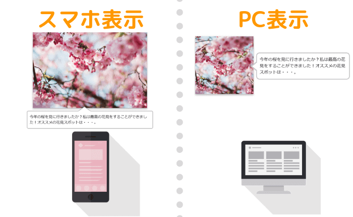
}画像に吹き出しを追加する
画像の横や、画像の下に吹き出しを追加します。
以下の記事を参考・多少改変しました。
そうです、これはサルワカさんが多用しているもので、画像を使って説明する際に、非常に分かりやすくなるため便利です。
画像は、600px×600pxを使用しました。
できるだけ正方形に近い画像の方がいいのかなと思います。
<div class="fukidesc">
  <div class="fukiimg">
    <p><img src="ここに画像のURL" alt="" width="600" height="600" /></p>
  </div>
  <div class="fukicell">
    <div class="fukip">
      <p>吹き出しの中身</p>
    </div>
  </div>
</div>.fukidesc {
display: table;
box-sizing: border-box;
margin-bottom: 2em;
width: 100%;
}
.fukicell {
display: table-cell;
vertical-align: middle;
width: 50%;
padding-right: 10px;
}
.fukidesc .fukibig {
width: 62%;
}
.fukiimg {
display: table-cell;
vertical-align: middle;
width: 31%;
padding-right: 10px;
}
.fukiimg img {
width: 100%;
height: auto;
box-shadow: 0 2px 7px rgba(0, 0, 0, 0.15), 0 5px 6px rgba(0, 0, 0, 0.15);
}
.fukicell {
display: table-cell;
vertical-align: middle;
width: 49%;
position: relative;
}
.fukip {
border: #ccc solid 3px;
position: relative;
background: white;
padding: 12px 10px;
border-radius: 13px;
}
.fukip:before {
border-right: 23px solid #ccc;
border-bottom: 20px solid transparent;
border-top: 20px solid transparent;
top: 30%;
content: '';
position: absolute;
left: -23px;
}
.fukip p {
margin: 0;
}
.fukip:after {
content: '';
position: absolute;
border-right: 24px solid #fff;
border-bottom: 20px solid transparent;
border-top: 20px solid transparent;
top: 30%;
left: -17px;
}
@media screen and (max-width: 600px) {
.fukicell, .fukidesc, .fukip, .fukiimg,
.post-content .codefuki .codebig, .fukiimg img,
.post-content .fukidesc .fukisml,
.post-content .fukidesc .fukibig {
display: block;
width: 100%;
box-sizing: border-box;
}
.fukiimg {
padding: 10px 25px;
}
.fukiimg {
max-width: 600px;
text-align: center;
}
.fukip:before {
border-bottom: 20px solid silver;
border-left: 30px solid transparent;
border-right: 30px solid transparent;
top: -40px;
content: '';
position: absolute;
left: 40%;
}
.fukip:after {
border-bottom: 20px solid white;
border-left: 30px solid transparent;
border-right: 30px solid transparent;
top: -37px;
content: '';
position: absolute;
left: 40%;
}
.fukicell {
padding-top: 0px;
padding-right: 0;
}
.fukip {
border-radius: 6px;
background: white;
margin-top: -14px;
border: solid 2px silver;
}
}吹き出しのデザインCSSまとめ
今回は、吹き出しについてサンプルをまとめてみました!
吹き出しは、基本的に囲み枠+三角形でできるため、以下の囲み枠のデザインサンプル例を元に三角形を組み合わせれば、自分好みのオリジナルなものも作ることができます!
ぜひ以下の記事を参考にオリジナルのデザインを活用して、より見やすい記事づくりをしていきましょう!